Sunday, 28 February 2010

Analysis of double page spread designs


Initial design one:
The main image takes up half of the left hand page with the text relating to the headline underneath. This draws the attention to the image and therefore the audience can see the artist that was on the cover, is now in this picture and will know it is the correct story they are looking at. The page number is in the bottom left hand corner, this can be clearly seen to the reader and looks professional like other music magazines. There is a smaller image of the artist on the right hand page which takes up half the width of the page. I got this idea by looking at Q magazine there was a double page spread with a similar look, i adapted it to make it my own and finally put text around the image in columns again by doing this is looks like an everyday music magazine that you would find on the shelf.


Initial design two: For my second initial design i decided to use several smaller image of the artist out and about at events, the text like my other designs is in columns making it look like a typical music magazine. There is also a quote from the article from what the artist has said, again this has been used in typical music magazines and looks like an average double page spread. On the right hand page is a large image on its own this shows that the article is purely about this artist in particular. The headline of the article is in the top left hand corner which is visible when you turn onto the page, like my previous initial design the page number in the bottom left hand corner.


Initial design three: My final initial design for my double page spread includes all the text of the article of the left hand page with an image in the bottom right hand corner. A larger image is situated on the right hand page similar to initial design two. Again their is a quote from the article but is been placed differently on the page. Similar to my first initial designs the page number is in the bottom left hand corner and this way it wont overlap the image on the right hand page and the attention wont be taken away from the artist.
Analysis of front page designs


Initial design one: I placed the masthead just to the left of the center as this has been used on Kerrang magazine which i analysed, i think by placing the masthead here it can be clearly seen by the customers as it will be bold when the magazine is on the shelf and therefore intrigues the target audience to buy the magazine. There will be a coverline in the top right hand corner with a smaller image, this shows the importance of this story and will make it appealing to the audience to buy the magazine as they can see a picture of the artist they like. The main image will be stiuated to the left hand side of the magazine with the headline that corresponds with it, being on the bottom right hand side. The image will be large and take half the space of the cover up with a large headline so it draws attention to a interesting storyline.


Initial design two: I placed the Masthead of this initial design on the left hand thrid of the magazine similar to Q magazine. This then can be clearly visable when on show in a shop, and the catchy title of the magazine will be brought by the target audience. The image is on the right hand side of the front cover with the headline overlaping the image, this is used in daily magazines so by using this effect it will look very professional. Also the coverlines will overlap the image of the artist so the cover blends in well will with all the elements it has to it.


Initial design three: For my third initial design i placed a coverline across the top of the magazine in a banner, again i came up with this idea by analysing other music magazines and thus will create the feel of a appropriate music magazine. The masthead is similarly placed to initial design one and again can be clearly visable to the target audience when displayed on a shelf in a shop. The main headline and sub heading relating to the main image is to the left of the image with an offer advertised below the heading. By having lots of detail on the cover it will fill up white space and make the front cover appealing to the target audience with a professional affect.

Tuesday, 9 February 2010

Initial ideas for titles:

Ministry
Starstruck
MusicMag

Images: I will have one main image on my front cover either of a girl band or a single female artist. I like both backgrounds in the images below as they are opposite to each other, one has a busy red carpet event and the other a cream stone wall. I will include several images inside the magazine of the artist showing different side to them and this will keep the audience interested. The first image is more practical to take as i will not be able to access a red carpet event, by having a simplistic background it makes the artist stand out, and will draw the audiences attention to the outfit, pose, hair and make-up.


Stories: I will display the main headline on the front cover with other cover lines either around the image below/above the image or on the image itself, my ideas for storylines include:

Watch out for (Name of celebrity)new hit!
(Name of celebrity)reveals what life is like on the road
Behind the scenes at the Grammys
The making of (Name of celebrity)
Exclusice interview with (Name of celebrity)

Fonts: I like the idea of simplistic/italic fonts on the cover but my masthead will make it larger so it stands out and catches the target audiences eye. The font exaples below are some thoughts i think would look interesting on my music magazine.


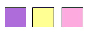
Colours:My first intial idea of colours consisted of purple, light yellow and baby pink, i found they didn't work very well together and wern't very bright. I need brighter colours for my music magazine so it sands out to the target audience.

My second intial colour scheme is using brighter colours than the first making the cover of the magazine stand out on the shelf. I have chosen green, pink and a light blue which work well with each other. I will be using colours similar to these for my magazine.

My third and final intial idea included the colours purple, pink and a lighter purple although i liked these colours they wern't unisex so therfore i didnt think it would appeal to male teenagers and also would limit the sale number of my music magazine.


Saturday, 6 February 2010

Audience Demographics

When creating any new media product audience demograhics (analysis) is the starting point, the media need to find out vital elements of their target audience before launching their product. Audience Demographics include: target audiences age, gender, type of employment, hobbies, their income and others that are suitable that determine how to get the media product to the consumer. By the media relating to the target audience and having an insight into their preferances, the media product will be more appealing and eye catching to them. This will create intrest in the media product and will determine how succesful it will be. So when creating my media product i will create questionnaires for my target audience and thus find out their preferences in order to determine the success of my media product.
Uses and Gratitfications Theory

The Uses and Gratitfications theory has an audience centered approach, the theory is centred around the audience by seeing what they do with media rather than seeing what media does to the consumer. This allows the audience to take an active role in finding out what media is and means in their own lives. The theory makes the audience responsible for choosing the type of media that meets their needs, for example if a consumer enjoys pop music they wouldn't buy a heavy metal magazine, they can determine the genre of the magazine by the image of a celebrity, colours, fonts and text size on the cover. This suggests that people use the media to aim at a specific satisfaction (gratifications).This shows me how effective the front cover of a magazine is to the audience and will help me design and create my music magazine.

Friday, 5 February 2010

Maslow's Hierarchy of need


Maslow's Hierarchy of need is a physcology theory created by Abraham Maslow, the image above shows how the theory can be represented in a pyramid. The basic human needs to surive is represented at the bottom of the pyramid and luxury items are higher up. Maslow's Hierarchy of need can be applyed to media products, for example my music magazine would be at the top of the pyramid as a luxurious item, this is because customers will only purchase this once they can afford it as they don't need it to survive. The theory can also help when advertising media products an example would be food and drink as they are essential needs, advertising for these products will be low key as they know it will sell. When luxury items need selling such as a magazine at the top of the pyramid they need rare and imaginative ideas in order to sell the product.

Tuesday, 2 February 2010

Analysis of Target Audience


This is Megan, Megan is an example of my target audience for the music magazine i will be creating. She is 18 years old and lives in the pretty town of Hertford. Megan enjoys going out with her friends to bars and clubs in London on weekends, she listens to current pop music in the charts and house music when played in clubs such as the Saturdays, Lady GaGa, Girls Aloud, Jason Derulo, Owl City, Katy Perry, Florence and the machine, Justin Bieber and many more . Megan will switch of rock and metal music as there hard to sing and dance to which she loves to do. She attends sixth form and is an average student and obtains C grades, currently Megan is applying for university in london to pursue a career in fashion. On weekends she attends dance classes and has performed in shows in front of large audiences which makes her a confident teenager. On weeknights Megan watches programs such as Hollyoaks, 90210, E News, Glee, Gossip Girl, MTV music channels, One tree hill and Skins. These programs feature on the channels E4, Channel 4 E!, MTV and ITV2. Megan will not watch sport programe's on Sky Sports as she finds them unappealing and has no interest in them. As well as watching the television Megan enjoys watching movies, she mainly enjoys chick flicks and romantic comedy's such as The Twilight Saga, The Hangover, Mean Girls, What happened in vegas, The notebook, Sex and the city, The holiday, American pie and lots more. Megan dislikes Si-Fi films as she doesn't find them interesting due to the lack of comedy in this genre of film. Megan likes to keep up with fashion and regularly shops in Topshop, H&M, Warehouse, River Island although she loves designer brands but finds they are to expensive to purchase!